UX Guidelines for Automotive Web Apps in the TiVo Experience
Introduction
This document provides important guidelines for web app developers and content service providers that will improve all web apps running on DTS AutoStage™ Video Service, Powered by TiVo™.
These design considerations will ensure a usable and enjoyable experience for users who will be using a touch screen in the car instead of a cursor or a keypad. They will expect an experience closer to a tablet or phone than a PC or TV.
Key Differences to Keep in Mind
Think of the automotive video discovery experience as a streamlined version of your existing web app. The profile used will be the mobile version of your web app in landscape only mode. It should be simple to navigate and provide focused options.
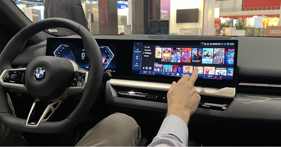
Keep in mind that, due to driver distraction regulations, video apps and content displayed on the driver screen (central console screen) will become hidden as soon as the car starts moving and will become visible again when the car stops.
Recommendations:
- Responsive design optimised for various screen resolutions, aspect ratios and layouts, including extreme wide screen and high resolution.
- Design for touch interface at an arm’s length – swipe, scroll, larger targets, etc.
- The playback action (e.g. Watch Now) should be visible above the fold.
- Simplify navigation options and the number of choices presented to the user.
- Minimise the need for keyboard entry and consider QR code alternatives.
- Picture-in-Picture (overlaying video playback) performance may be limited by hardware.
- Apps should NOT rely on input devices like the BMW iDrive (or equivalent in other cars) as they are not always optimised for advanced use cases like in-car video.
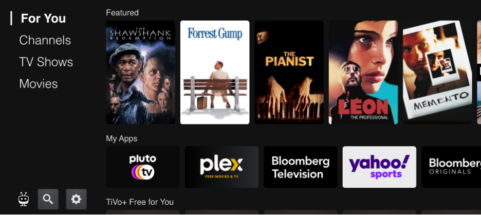
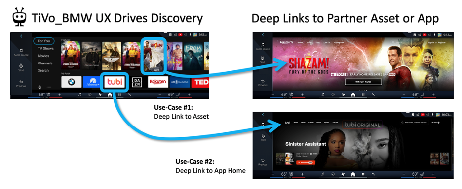
A Content-First User Experience
TiVo delivers content-first experiences, providing deep links to assets and to the top level of your web app.
User Interaction and Core Features
We recommend the following design guidelines.
Touch Interface
- Make tapping and swiping the main user action.
- Carousels should scroll and avoid navigational buttons.
Generous Tap Targets
Whether the tap target is a menu item or an icon, consider the user’s ability to comfortably target their finger to tap the desired UI element. Drivers may be reaching over awkwardly or may be encumbered by a seat belt.
We recommend a minimum 76 x 76 dp (density independent pixels) for tap target. A dp is equal to one physical pixel on a screen with a density of 160, so if the target display is 240 dpi, then your tap target should be a minimum of:
76 x 240 / 160 = 114 pixels
- Browser-based zoom is an effective solution for increasing menus and touch targets.
- Zoom factor will work best when using responsive design.
- Avoid mixing fixed and responsive layout solutions.
Note: TiVo and the car OEM will manage browser-based zoom to ensure touch target accessibility.
Visual Feedback
Consider providing visual feedback on components whenever users take an action (tap, press, drag, etc.) to provide an instant response and/or a state change. For example, if a user taps a menu item, give the user a visual indication that the tap was received.
Optimise Playback
We want to launch the user into a full-screen, seamless video experience when they open the app from a deep link (while respecting the content’s native resolution) and unadorned with controls, menus, and icons. The playback experience should be more enjoyable – larger screen, better sound – than if the user were watching on their mobile device.
Time to Playback
When a user selects a title, the video should play immediately (after no more than a few seconds). Audio should play with the video as the default. Avoid displaying more interim steps that require user interaction before video playback.
Minimise the end to end click path by offering landing pages that are focused on playback so that a user can launch directly into a full-screen playback experience.
Screen Resolutions and Aspect Ratios
In-cabin screens typically display some native car OEM HMI (e.g. climate control, quick access to other car features) at the same time as the TiVo UX. The screens also have full-screen mode (activated when the user presses the Fullscreen button on a video).
For example, the screenshot below is from an ultra-wide 3:1 screen. The area highlighted in pink is the OEM HMI, and the area not highlighted is the HTML viewport available to display the TiVo UI or the CSP web app.
Accommodate very high-res and different screen formats. Consider wide screen layouts (or ultra-wide 3:1).
Examples of viewport logical resolutions for in-cabin screens:
- 2160 x 637
- 1920 x 764
- 1280 x 720
- 1800 x 720
Note: Logical resolution and physical resolution are different because the Device Pixel Ratio is often higher than 1. Logical resolution is relevant for web apps._
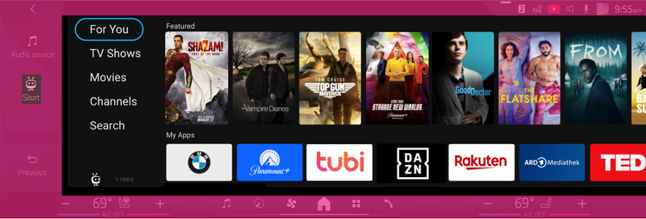
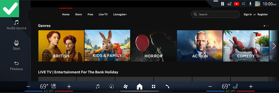
VOD Carousels
TiVo Automotive supports VOD and linear. Pure VOD solutions are simpler because they don’t include guides and Picture-in-Picture. Fast/AVOD typically includes guides and Picture-in-Picture and may require more attention to screen layout.
VOD carousels support all offer types: SVOD (subscription), AVOD (ad-supported), or TVOD (transactional).
Carousels generally look great in wide screen format. Ideally you want to be able to swipe them and interact with them smoothly.
Sometimes they are operated by tapping an arrow, and that scrolls an entire page of items in the carousel. It feels fine for a remote control or mouse, but not with tapping. Sometimes the items in carousels are too tall, and we can’t see the carousel and the title of the carousel at the same time.
The screenshot below is a good example of a simple layout. However, avoid button navigation (the arrows) where a swipe may be more intuitive.
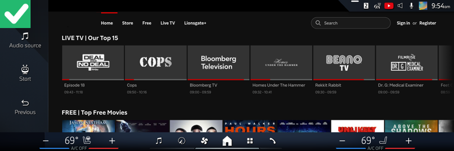
The following screenshot is a good example of a linear channel carousel. Consider including a progress indicator as seen for each channel shown below.
Linear Channels and EPG
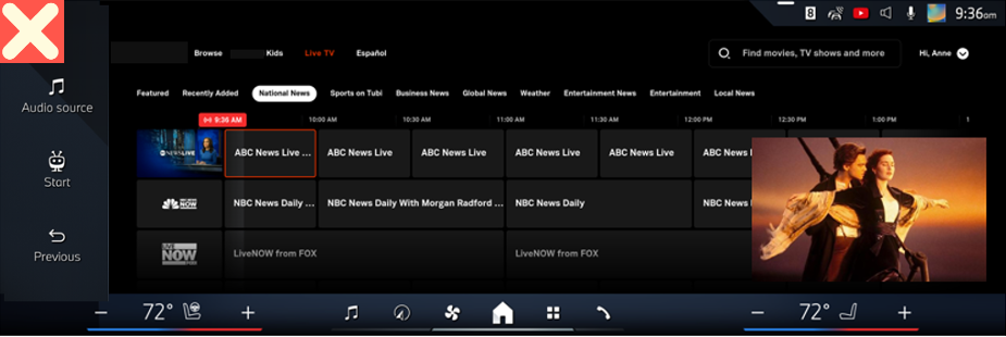
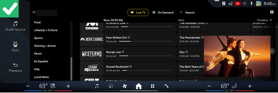
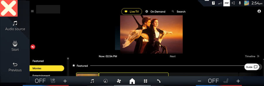
The screenshot below shows a traditional EPG with half-hour segments. Because of the ultra-wide screen, the grid guide shows many columns but few rows. That probably means fewer channels and lots of information about what’s in the future, which may not be very interesting for users.
The screenshot below is a good example of not wasting too much vertical space with logos or sections and by putting the sections on the left side of the screen. This example shows a simplified Now/Next guide.
External Links
Non-standard interactions can be difficult to translate to a touch screen. The browser works in a single tab environment, so do not use pop-up windows, new tabs, hover states, and footers with links to social media.
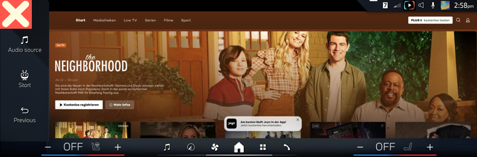
Beware of pop-ups. Pop-ups, if used, should not link outside of the application environment. The pop-up in the screenshot below is meant to trigger an app store download on a mobile device and should not be displayed inside of a car.
Links to external websites (social networks, advertisers) might be blocked from the vehicle browser and a QR code will be automatically displayed. This allows users to navigate using their own mobile device.

To improve the experience, you can include QR codes for the following types of external links:
- Social media
- Legal policies
- Terms and conditions
- App store downloads
- Pop-ups, for example, links to sponsors

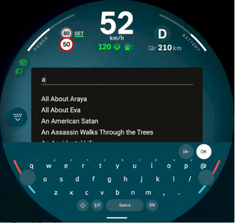
Search
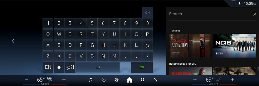
Search will reduce the viewport to show a virtual keyboard. This is typically triggered by setting focus on the HTML5 INPUT element.
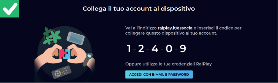
Account Login
Users are looking to watch content quickly. We strongly recommend using QR codes to allow for account login and creation on a mobile device. The below screenshot points the user to a URL and then allows login from mobile with a simple pairing code.
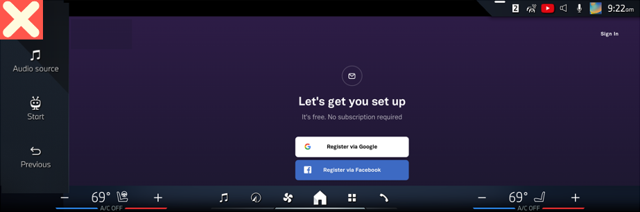
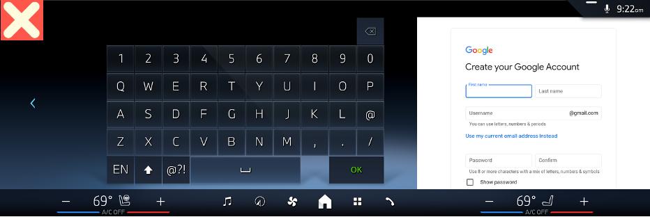
The below screenshot relies on login credentials to be entered directly on the screen. This is usually not optimal and may also not fully work if your application uses pop-ups which are not supported.
Visual Design
Consider the following design recommendations for colour, poster artwork, fonts, and menus.
Color
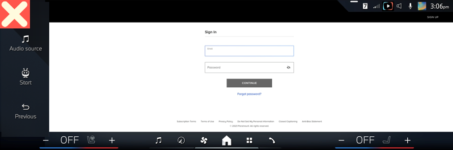
While white is a popular colour for web applications, darker backgrounds will be easier on the user’s eyes and will transition better to watching video in the car. Setting a black background colour is recommended.
The below screenshot uses too much white, which is best to avoid.
Poster Artwork
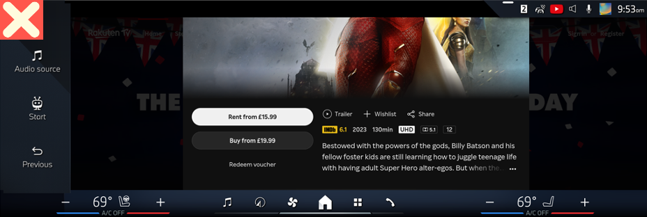
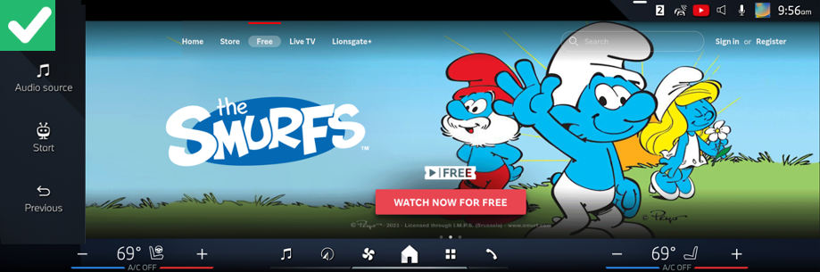
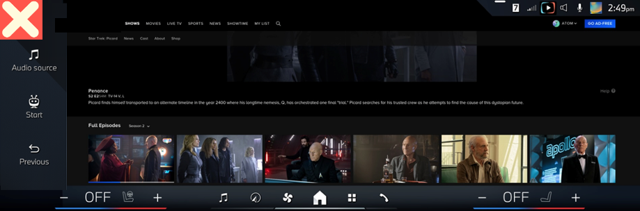
Consider poster art that will be more compatible with wide screen format. The following screenshots show important information (title, artwork, and offer type) is cut off. The playback action is also not visible without scrolling.
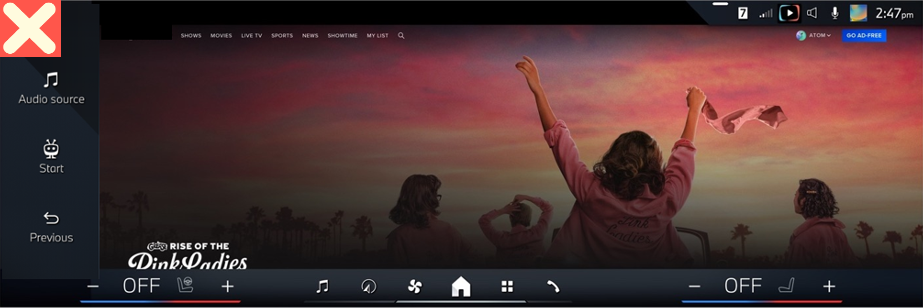
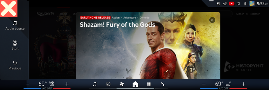
The following screenshot is a good example of poster artwork. Title, artwork, and offer type are all visible.
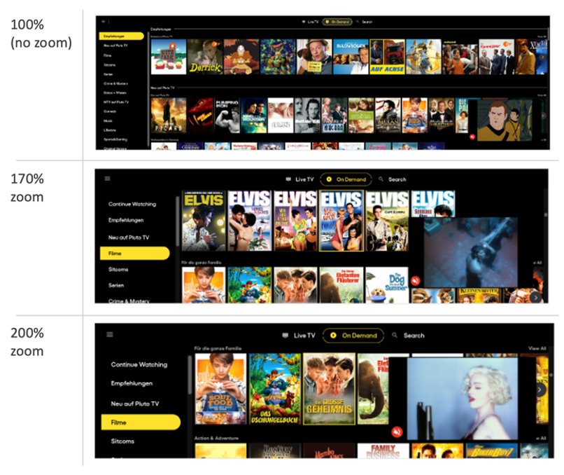
Font Sizing
Make sure that fonts are large with plenty of contrast for comfortable legibility. Car screens can be more susceptible to reflections from the sun.
The diagonal size of the screen is 14.9”. We recommend a minimum 24 dp for body text and 20 dp for all other text.
The screenshot below shows font size that is displayed with no zoom and is too small.
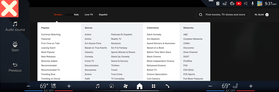
Menus
The screenshot below shows too many menus and font size that is too small. It is best to limit menu options and to design menus that are easy to read and tap.
Tips to Consider
Below are additional things to consider when designing web apps in the TiVo experience:
- Be prepared to handle unreliable internet connections and have some visual clues so the user isn’t left wondering if something is loading or if the app froze. Consider a subtle animated bar at the top shown when something is loading.
- The screen in the car is a fixed device and doesn’t allow for rotation. You should block rotation prompts in automotive environments.
- The screenshot below is an example of overlapping playback controls that should be avoided. We recommend ensuring that playback controls consider the browser-based zoom factor.
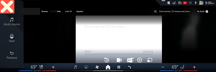
- The screenshot below is an example of how the layout pushes too much below the fold.
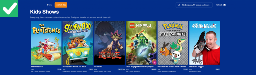
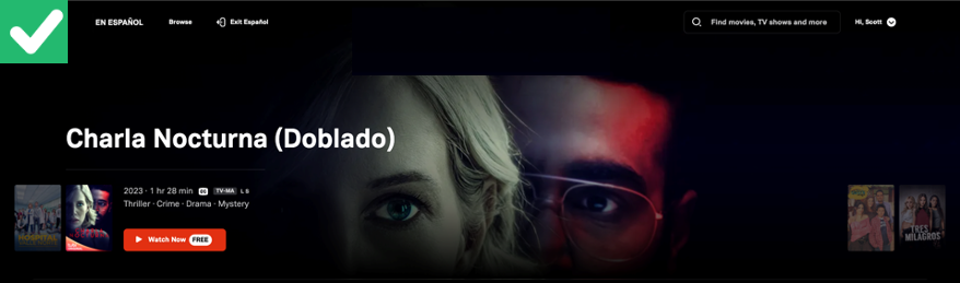
- The screenshots below are good examples of modal Kids and Spanish language catalogues.
- Screen designs optimised for vertical layouts don’t always translate well. You should avoid stacking video playback and EPG.
Conclusion
This document provides TiVo partners with UX guidelines for web apps running on DTS AutoStage™ Video Service, Powered by TiVo™.
The best practices provided in this document will help you create web apps that enhance a content-first discovery experience.